
How to design a logo
- Ashley Rose
- Apr 20, 2020
- 18 min read
How to design a logo: the ultimate guide
📷
Have you ever seen a big brand without a logo? No? That’s because there aren’t any. A logo has a major impact on how your customers will perceive your brand. So naturally, you want your logo to be outstanding. But how do you get there?
Don’t fret! This handy guide will teach you everything you need to know to design the perfect logo for you and your business. From defining your brand’s identity and understanding what makes a great logo, to making the right design choices and navigating the design process, read on to learn how to design a logo.
Here are the most important steps to designing a logo: —
You may be asking yourself: How can I design my own logo? These are the steps you need to follow:
Understand why you need a logo Define your brand identity Find inspiration for your design Check out the competition Choose your design style Find the right type of logo Pay attention to color Pick the right typography Communicate with your designer Evaluate your logo options What not to do when designing a logo Integrate your logo design into your brand
1. Understand why you need a logo. And why it needs to be great. —
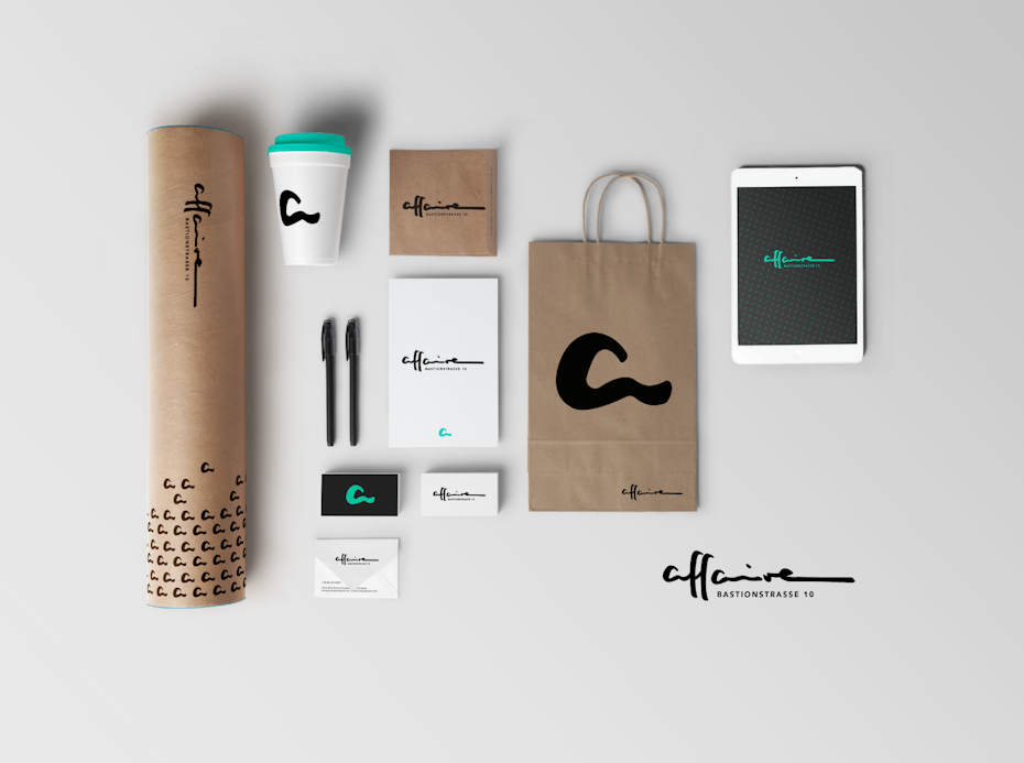
📷A complete logo and brand identity design for affaire, designed by nnorth
Business really is like dating—you’re trying to attract the right customers and make them fall head over heels in love with your brand. So think of your logo as the picture on your dating profile. It’s what’s going to make people take interest and try to learn more about you (or swipe left because you’re not for them). So you want to look your best, right?
Download the free ebook and learn how to create the perfect logo!
Enter your email to get the logo ebook, along with creative tips, resources and the occasional promo (which you can opt-out of anytime).
Your logo will have a huge impact on the first impression your business is going to make: It will give your customers information about your brand and let them know if it’s right for them.
Because your logo is such an essential part of your brand, you want to make sure it’s done well. All your branding materials will have your logo on them. It’ll stare back at your customers from your website, your packaging, and your business cards. Make it count! A great, professional logo design not only has the power to communicate what you stand for. It will also make a good first impression and help you stand out from the competition.
2. Define your brand identity
—
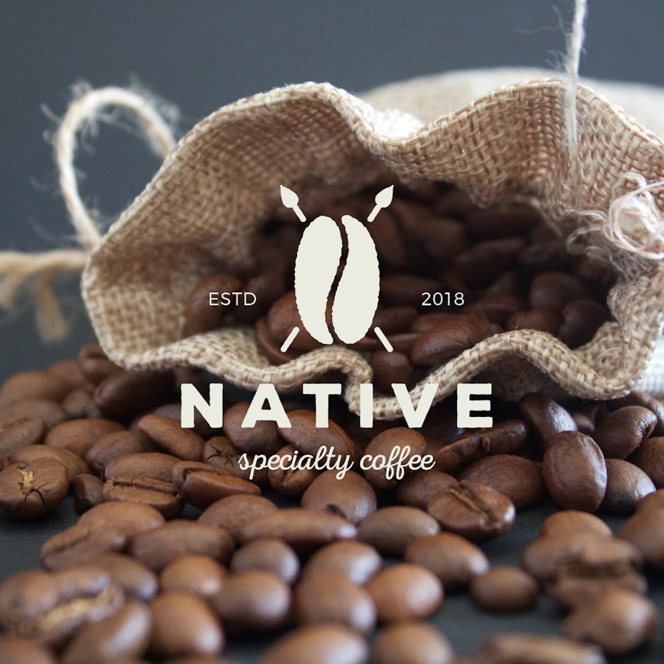
📷Logo design for Native specialty coffee by Sava Stoic.
You want your logo to communicate your brand’s personality. And in order to do that, you first need to understand what your brand’s core personality is. Once you have a clear idea of what makes you unique and what your brand is all about, it will be much easier for you to make design choices that complement and complete that picture.
Here are some questions you can ask yourself, to get to the bottom of your brand identity:
Why did we start this business?
What are beliefs and values that are important to us as a company?
What do we do better than anyone else?
What makes us special?
If we could describe our brand in three words, what would they be?
What are the three words we would want our customers to use to describe us?
3. Find inspiration for your design
—
The hardest part of the design process can be the search for logo inspiration. Luckily we’ve got some tips for you that will make it really easy.
Start with a brainstorm

📷Logo design for idearoute by brandsformed®.
Perhaps you are a conceptual person and like to start off with collecting verbal ideas. A proper brainstorming session can be just what you need to pin down the look and feel you’re trying to achieve. Here are three steps that will help you draw out the best creative logo ideas:
1. Follow the rules of the brainstorm: Brainstorming is about getting all ideas out (even those really really bad ones) and writing them down. Even a horrible idea can spark a conversation that leads to a genius solution.
2. Think like your audience: Make a list of words that describe your brand and how you want it to be perceived. Think like a person in your target demographic and always remember what would be important to them.
3. Get everyone involved: A one-person-brainstorm is fine, but only diversity will make the magic happen. Bring in people from every department or even friends and business partners. The more perspectives, the better.
Logo for Crypto Caveman designed by Virtuoso”📷
Logo for Sweet Trip designed by Terry Bogard📷
When it comes to brainstorming your logo, don’t be afraid of thinking out of the box and being a bit different. See how logos like the ones for Crypto Caveman and Sweet Trip cleverly combine ideas that you wouldn’t necessarily associate with each other—like cryptocurrencies and cavemen or a honey bee and a pin on a map? These original logo choices help them express character and stand out from the crowd.
Make a mood board
If you’re a visual person, a mood board may be the perfect tool for you to get inspired. You can create an actual board by cutting out and pinning printed images or make a digital one (Pinterest would be the obvious choice here). Simply collect all the images you feel drawn to—those can be other logos, color combinations, illustrations or graphics, go wild! You’ll see, your mood board will reflect what style and design features you are gravitating towards in no time. Need a good place to start? We suggest checking out the 99designs logo inspiration gallery.
Logo for Simply Rooted designed by Virtuoso”📷
Logo for Rugged designed by KaWolfram📷
Think about how your business can be visualized in your logo. Simply Rooted is all about local, down-to-earth food and their vintage logo perfectly reflects that with hand drawn root vegetables. If you’re striving for a similar aesthetic, your mood board might include images of vintage logos, handmade illustrations and organic shapes and colors. Or take a look how the Rugged logo visualizes their “rugged” brand identity in a bold and rough looking word mark but still includes a luxurious vibe with a reflective gold effect. Your mood board gives you the opportunity to pull all these elements together.
4. Check out the competition
—
The best place to steal borrow ideas? Your competition! Check out what’s already out there, what works well with your audience and what you should avoid. While stalking those other businesses, think about what makes them different from you and how you can emphasise these differences in your logo design.
Be sure to clearly set yourself apart from your competition. If all the other businesses in your industry are going monochrome, maybe you should opt for some color to stand out. If everyone else is traditional, maybe a fun and modern logo will attract attention.
A classic accounting logo for Orthrus Ventures designed by Genovius📷
A modern accounting logo for Tidy Finance designed by minimalexa📷
A fun and lighthearted accounting logo for HotToast designed by scribe📷
Check out the three accountant logos above and how they communicate their brand personalities. The lion logo for Orthrus Ventures is classic and reliable, while the Tidy Finance logo seems modern and cool. However, if fun and approachable is what you’re going for, let Hot Toast inspire you with its bright color and whimsical illustration.
5. Choose your design style
—
Now that you have a clear idea of your brand and are feeling inspired, it’s time to start translating that into design. There are lots of different elements that come into play here, from colors, shapes and graphics to typography. Isolating each component and what it can do for your logo will help you take things step by step, rather than getting overwhelmed with the whole design all at once.
When thinking about your logo, the first thing you want to do is pick the right design aesthetic for your brand. There is no one style that is right for everyone, only what’s best for your brand.
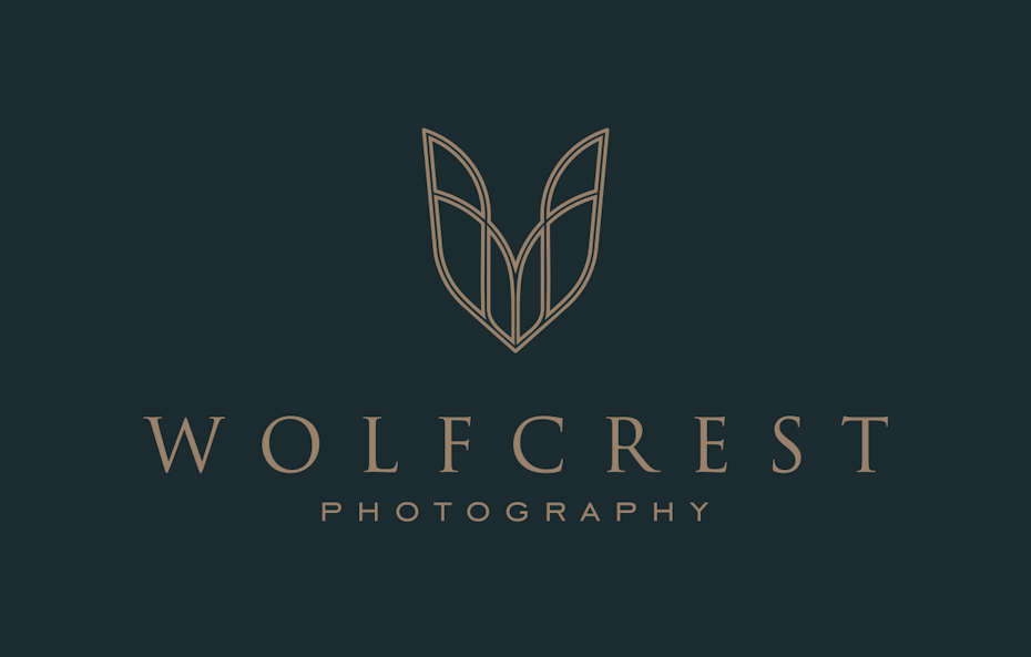
📷A classic and timeless logo for Wolfcrest designed by eLyateh
Classic
Trendy logos can be fun and exciting, but they can quickly look outdated. A classic style gives you better staying power and can help you reach a broader audience. This aesthetic keeps it simple and doesn’t venture out into crazy color palettes, graphics or fonts. A classic style tells people that you are reliable and down to earth.
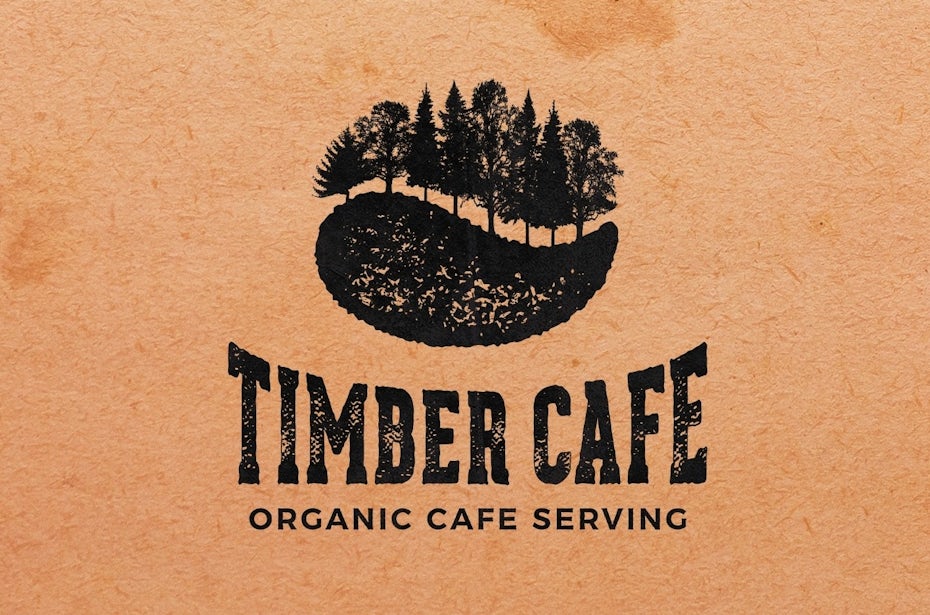
📷A cool vintage logo for Timber Cafe designed by Sava Stoic
Retro or vintage
There is a reason why vintage and retro design have been on trend for quite some time now. They instantly remind you of the past and evoke romantic feelings of nostalgia. A vintage logo tells customers that history is important to you and that whatever you sell is done right. Worn and hand-illustrated logos in brown and beige color palettes fit this aesthetic beautifully.
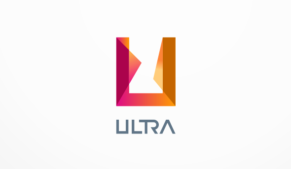
📷An ultra modern, simple geometric logo for Ultra, designed by artsigma
Modern and minimalist
Brands often choose a clean and minimalist style to communicate how fresh and modern they are. This style uses a lot of whitespace, minimal details and simple lines often resulting in sleek, pared back logos. A minimalist and modern style shows your customers that your brand is up-to-date, cool and knows what counts.
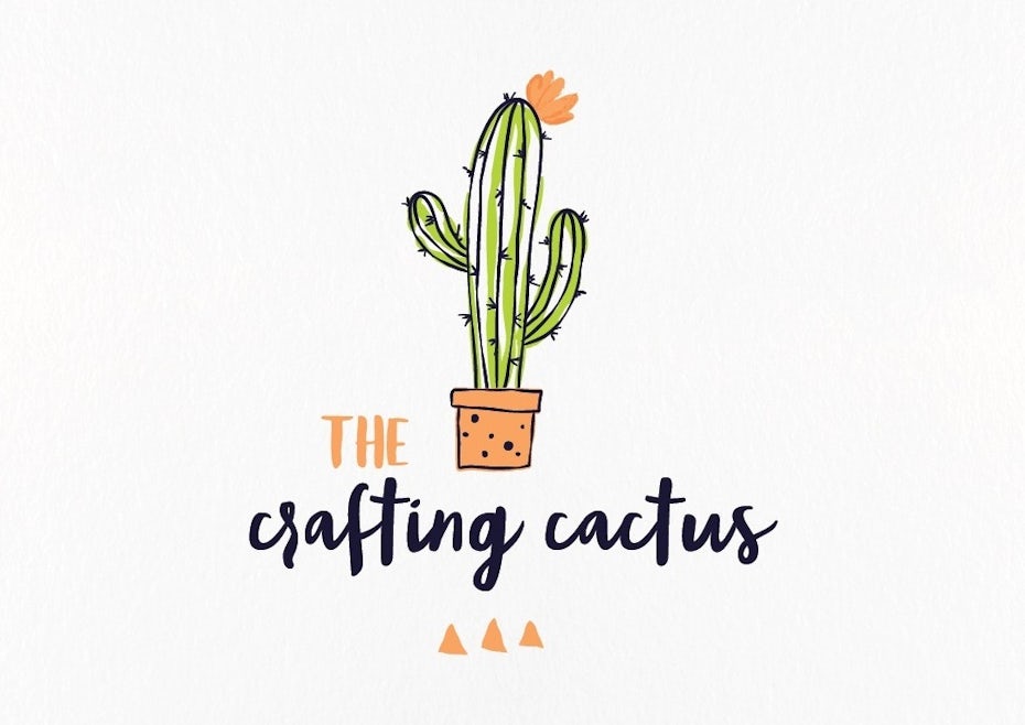
📷A colorful, whimsical logo for The crafting cactus designed by ananana14
Fun and quirky
This is a popular choice for brands with a young (or young at heart) target customer. Fun and quirky style tends to be colorful and cute and often uses symbols or illustrations to create a positive and friendly vibe. Go for a whimsical mascot or a sweet illustration to let your brand’s fun character shine through.
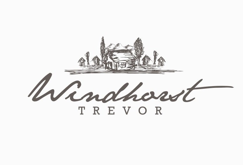
📷Artfully handdrawn logo for Windhorst designed by bo_rad
Handmade and handcrafted
Handcrafted style transports a clear message: this brand is individualistic and stands for handmade quality. The style works well in combination with other aesthetics, like vintage, to really drive the message home. But it can be combined with minimal and fun styles as well for a simple and sophisticated or a bright and youthful look.
Can’t pick just one?
Of course these styles aren’t mutually exclusive: Just mix and match them to suit your brand. For instance your brand can be both handmade and fun at the same time, just take a look at how the quirky, illustrated logo for The Crafting Cactus pulls it off.
6. Find the right type of logo
—
In addition to the overall style there are 7 main types of logos you can choose from when you are creating your logo. You can pick the one that suits your company name or overall aesthetic best, or combine them to create something unique.
Lettermark for Mark & Scribe designed by mm graphics📷
Wordmark for One designed by artsigma📷
Lettermarks (or monogram logos)
Lettermark logos can be great to streamline your company logo, especially if your name is very long or hard to remember. Lots of businesses choose to go by their initials, just think of HP, CNN or H&M. These monograms can be great for minimalist logos, but remember that they are not very good at expressing what your business is about.
Wordmarks (or logotypes)
Wordmarks are a very straightforward way of using you company name as a logo. To give them personality and recognition value, they are all about typography—just look at the wordmark logo for ONE. If you’ve got a great name for your brand, this could be the perfect way to put it in the foreground.
Pictorial mark for Storm designed by Spoonlancer📷
Abstract logo for Printy designed by artsigma📷
Mascot for Gadget Mole designed by 3AM3I📷
Pictorial marks (or logo symbols)
Pictorial marks or logo symbols are what we think of when we hear the word “logo”. They are iconographic images that are easily recognizable and represent your brand with an image. You can choose something simplistic or more complex, but make sure to pick a symbol that creates a unique connection to your brand. Oftentimes these are paired with a wordmark (ya know, so customers know your name… at least until you’re on par with Apple and Target in terms of brand recognition).
Abstract logo marks
Instead of a recognizable symbol, abstract logo marks are geometric forms that don’t establish an immediate connection to an existing image but create something entirely new for your brand. An abstract logo mark will condense your business into a symbol that is truly unique to you. The logo for Printy shows how modern an abstract symbol can look, while having lots of personality at the same time. If you want your abstract logo to create a certain mood or feeling, find out the meanings of different geometric logo shapes.
Mascots
Mascot logos are a fun way of giving your brand a personality. They are often colorful, cartoonish characters that represent your business in a family-friendly and approachable way, like the cheerful Gadget Mole above.
Combination mark for Brite Side designed by ludibes📷
Emblem logo for Rockwell Lighthouse designed by Project 4📷
Combination mark
A combination mark does exactly what it says on the tin: it combines a symbol with a word mark to create an easily recognizable logo. The brand name is either placed next to the symbol, or is integrated in the graphic element, like designer ludibes demonstrates with the Brite Side logo. People will associate both elements with your brand, which allows you to use them both alone or together.
Emblem
Similar to combination marks, emblem logos are also often a combination of word and pictorial elements. They usually consist of text integrated in a symbol or icon, such as badges, seals or crests. The Rockwell Lighthouse emblem shows, how these traditional shapes can give you a very old-school and classic appearance.
7. Pay attention to color
—
Colors can have a ton of different meanings. The psychology behind color is complex, but to keep it short, colors have certain emotions and ideas attached to them. To learn more about color theory be sure to check out this in-depth guide on logo colors and their meanings.
Red logo for Food Hunter by Yo!Design📷
Yellow and orange logo for Mynergy by Hermeneutic ®📷
Green logo for Urban Toad by J_Ivan📷
Blue logo for message bottle by bo_rad📷
Pink and purple logo for Clara’s by Polly_📷
Brown logo for Golden Dates by Zvucifantasticno📷
Red: Red stands for excitement, passion and anger. It’s a great choice if your brand is loud, youthful and wants to stand out.
Orange: Orange is much less used than red but it’s just as energetic. This is a vibrant, invigorating and playful color.
Yellow: If you want to look accessible and friendly, yellow is the right choice. It gives off a cheerful, affordable and youthful energy.
Green: Green is extremely versatile and can work for any brand really. It’s especially perfect for anyone who wants to establish a connection to nature.
Blue: Blue is a very classic and common choice. It is calming and cool and symbolizes trustworthiness and maturity.
Purple: Purple can be your ticket to looking luxurious. Depending on the shade, purple can be mysterious, eclectic or feminine.
Pink: If you’re going for girly, nothing works better than pink. But that’s not all! With shades like pastel rose, millennial pink or neon magenta, pink can give your logo a grown up and cool, but still youthful and feminine look.
Brown: Brown may sound like a strange color choice at first, but it works perfectly for rugged and masculine vintage logos. It can give your brand a handmade, unique and aged look.
Black: If you are looking for a sleek, modern and luxurious look, black will be a great choice. A minimalist black and white logo is the way to go if you want to keep it simple.
White: You want your logo to look clean, modern and minimalistic? Use lots of white in your logo. As a neutral color it works in combination with all other colors, but adds a clean, youthful and economical touch.
Gray: Gray is the ultimate color if you want to achieve a mature, classic and serious look. Darker shades look more mysterious, while lighter shades are more accessible.
Combining colors
The color wheel📷
Of course you don’t need to stick with a monochrome logo using just one color, but you can combine several logos colors to tell a complete brand color story. To choose colors that work well together, take a look at the color wheel.
Complementary colors lie directly across from each other on the color wheel. They bring out the best in both colors and create a very dynamic look.
Analogous colors fall close to each other on the wheel. If you want your logo colors to be harmonious, these will work well together.
Triadic colors draw from three equal sections on the color wheel. Pick these for a stimulating and bold effect.
In the logo for Soul Glow analogous work together to create a harmonious effect. Designed by Dudeowl.📷
The complementary blue and orange in this logo make both colors pop. Designed by onripus.📷
8. Pick the right typography
—
You want to pick a font that complements and completes your logo. There are 4 basic types of fonts you can work with to give your logo a unique look:
A classic and elegant serif font designed by sonjablue.📷
A logo with a modern sans serif font designed by simolio.📷
Serif fonts
See how the font gives the Avalon logo a chic and timeless look? Serif fonts can make your logo look classic and high-end. Serifs are the little “feet” at the end of letter, which make them look a little more old-fashioned. They are very versatile and look great with any kind of design, but work especially well with vintage, elegant or classic designs.
Sans serif fonts
Sans-serif fonts are perfect for a modern and clean look. They don’t have the little feet that serif fonts have which makes them look very sleek and simple. This works great for modern brands, like the minimal and cool Delta Salt logo above.
A hand drawn logo with script font designed by Mad pepper.📷
A decorative display font designed by Fe Melo.📷
Script fonts
Script fonts are reminiscent of handwriting. From elegant calligraphic fonts to relaxed and down-to-earth scripts, there is a huge variety out there. Use them to make your logo look more individualistic, like the Moon Rabbit logo above.
Display fonts
Display fonts are decorative fonts that are highly stylized and really catch the eye. Take a look at the Perfect You logo above that uses a display font to give the design a fun 70s flair.
Your typography can become really powerful when you combine different logo fonts with each other. Find out how in this guide to selecting fonts for your brand.
Bring your design elements together
A logo design that is both classic and elegant, designed by vraione.📷
The colorful abstract shape gives this logo a modern and unique look. Design by Vectorila.📷
Now that you have an idea of all the different elements your logo consists of, you need to make sure that they work together. You want to pair them in a way that is harmonious to create the vibe you are looking for.
The logo for skincare brand Voany leaves no doubt that it is an elegant, natural high-end brand, using a combination mark in an organic shape, a classic serif font and a natural brown and beige color palette. Reflect Academy on the other hand looks disruptive and eye-catching by combining a modern font with colorful and abstract shapes for a fresh and unique look.
9. Communicate with your designer
—
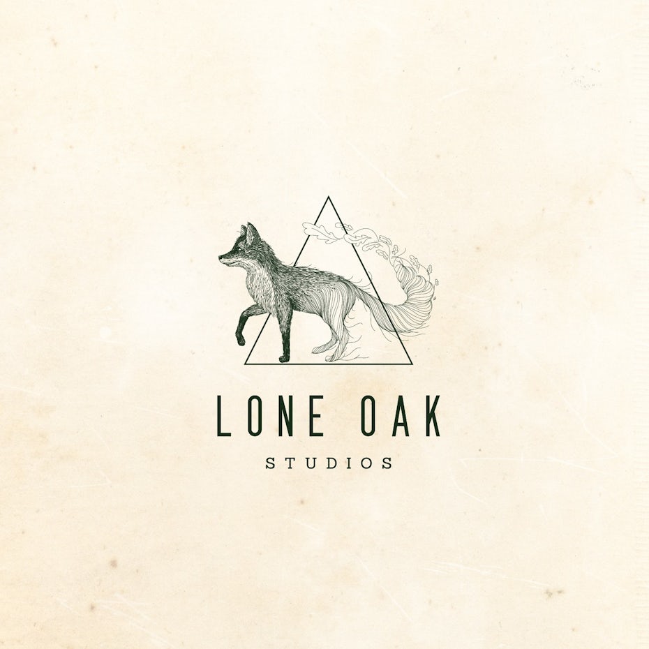
📷A unique and memorable logo for Lone Oak Studios by Mad pepper.
Now that you have considered all of the necessary style points, you’re ready to start designing! There are many ways to get a logo, so you should consider which one suits you best. Agency, logo contest, 1-to-1 project or logo maker? Different prices come with different qualities and all options have their pros and cons. To get a good overview of your options for getting a logo, check out this comparison of the best ways to get a logo designed. Read more about how much your logo design should cost here.
We might be biased, but we think a logo design contest is the best way to get a logo. To make sure your design comes out perfectly, the first rule of working with your designer is to communicate clearly. Writing a clear creative brief is your chance to make your designer understand who you are and what you need. Make sure to give them as much information about your company and style as you can, so they can create something really unique for you.
Sometimes it may take a little bit of trust in your designer, but try to stay open to suggestions. Remember, your designer is an expert and has a great feel for what makes a good logo. Giving lots of detailed and clear feedback is what gives designers an understanding of what you like. It may sound cheesy but it’s true: the best design happens when you and your designer work together.
10. Evaluate your options
—
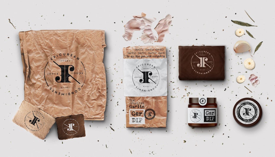
📷This logo by Martis Lupus is just one of the options Joyce Foods had to choose between in their logo design contest.
📷This logo by Martis Lupus is just one of the options Joyce Foods had to choose between in their logo design contest.
They also had the choice between this artisanal logo by Zvucifantasticno…📷
… this modern logo by Abda_99…📷
…and this hand-lettered logo by kapralcev, as well as 152 more designs. It’s like picking a favorite child!📷
Evaluating your logo options can be hard, so get some feedback from friends, potential customers and colleagues to help you make a decision.
What makes a good logo?
A good logo is immediately recognizable, reflects your brand’s message and makes you stand out. An effective logo looks professional and seamlessly fits in with a brand’s identity. A great logo also needs to work at any size and anywhere you want to use your logo.
A good logo:
is unique and distinctive
is memorable
works at any size and anywhere
reflects your brand identity
is timeless
But how to make a good logo? Here are some general questions to ask yourself when evaluating your logo options:
Can you tell what it is in 2 seconds? Will people immediately know what your business does?
Is it simple and memorable? Will your customers be able to remember it?
Is it versatile? Can it be applied to all your brand’s needs?
Is it timeless, or would you have to do a redesign in a couple of years?
Is it unique? Does it set you apart from your competitors?
Does it appeal to your target audience?
Obviously your brand’s needs and expectations for a logo will be much different if you sell children’s clothing and need a simple logo that can be stitched onto fabric than if you make sophisticated high-end wine with an intricate label, or a high-tech app that lives on peoples’ phones. So don’t forget to take a step back and consider the bigger picture while you’re designing your logo. This is not about personal taste, it’s about what works best for your brand.
11. What not to do when designing a logo
—
This logo for Cactus Dental is definitely not generic. Design by am121.📷
This logo for Smart Source is classic and timeless. Design by SimpleIsGood.📷
Keep it simple, like this logo for Knotte, designed by gaga vastard.📷
There are some common pitfalls that await you when you’re designing your logo. Here are some tips on what not to do:
Download the free ebook and learn how to create the perfect logo!
Enter your email to get the logo ebook, along with creative tips, resources and the occasional promo (which you can opt-out of anytime).
Get the ebook!
Don’t give in to the clichés of your industry. You’re a dentist so your logo needs to have a tooth in it? Definitely not. Here’s how to avoid generic logos.
Don’t make it too complicated. Simplicity is key for a memorable (and printable) logo.
Don’t try to be too trendy. Trends are fantastic, but make sure your logo won’t look dated in three years.
Don’t go with an amateur. Your friend/intern/cousin has used Photoshop before, so they can save you some money and design your logo? Just don’t.
12. Integrate your logo design into your brand —
Now that you know how to design a logo, what’s next?
Once you have your logo, you’ve created the ideal basis for all the branding material your business needs—whether it’s business cards, packaging design or web design. By setting the tone for your style, color palette, font and overall look and feel your logo is the starting point for your brand collateral and your designer will be able to create a seamless look for you. And just like that, your business is ready to show the world its brand new face!
Ready to get yourself the perfect logo?
Let our brilliant designer community create a unique brand mark for you.
This article was originally written by Kris Decker and published in 2017. It’s been updated with new information and examples.
The author
📷
Antonia manages 99designs' English blogs and is based in Berlin. By day she works on awesome design topics the world needs to know about, by night she's a painter with a passion for abstract art. Find her on Instagram @antoniagesch.
Tags
Related articles
📷
9 innovative logo design trends for 2018
📷
Branding vs. brand identity vs. logo: what’s the difference?
📷
How much should your logo design cost?
Any comments?
Save my name, email, and website in this browser for the next time I comment.
Post comment
📷
Harish
2 years ago
Loved the article. Beautifully explained everything. Thanks for posting.
📷
Michelle
last year
Thank you so much for sharing these tips! I do have one question though, do the fonts used in the logo need to match the font(s) used articles or posts on the blog or website? For example, if the logo uses a sans-serif font, should a sans-serif font also be used in articles/posts? I hope I’m making sense. Thanks!
📷
Jamahl
last year
They don’t have to match but should work well together, even in contrast. This article is a little more focused on typography.
📷
Rana R
last year
I love read 99designs blog, it’s clean and neat, eye-pleasing, also straightforward. In this page, I signed my e-mail to download this guide as an ebook, but I haven’t received the e-mail. Can anyone help? Thanks.
📷
Jamahl
last year
Hello, if you don’t see them in your junk/spam folder, please reach out to blog@99designs.com
📷
Mike
8 months ago
Not that I’ve ever used one of those swiping dating apps but I’m sure it’s Swipe Left if they’re not for you? 😉
📷
Jamahl
8 months ago
Good catch
📷
Ron
6 months ago
Nice work (but strictly speaking “sans serif” refers to typefaces not fonts (font = typeface * pointsize * attribute) – why perpetuate a Microsoft error?).
📷
Jamahl
6 months ago
Technically speaking, that is true. Because font is a commonplace term, I think the author is just simplifying the language for nondesigners.
📷
zoom
6 months ago
hot toast was my fav logo
📷
Kakraba Ababio
12 days ago
Please can I get this on my email as you it was done throughout the branding course
📷
Sandesh
3 days ago
Thank you so much for the article, it will help me to complete my project. Do you have more information about the logo & its importance.
📷
Antonia
3 days ago
Hi Sandesh, glad you liked the article! You can find more information on the importance of logos in this article: https://99designs.com/blog/tips/logo-importance/ Or download our free logo ebook here: https://99designs.com/blog/logo-branding/free-logo-ebook/ Best, Antonia
Current design contests
Designers, check out these contests so you can start building your career.
Successful supplement range re-brand (we will work with chosen...Product label | $799
Design a logo for high-end art/design businessLogo design | $298
Design a bold, geometric logo for an Alaskan Photography businessLogo & brand identity pack | $899
Design a Different Investment Firm Image and BrandLogo & brand guide | $341
Letterhead for Healthcare Recruiting AgencyStationery | $253
Contemporary and fresh logo for messaging app and marketing...Logo & brand guide | $1,479
Logos, websites & more!Get a design
Need creative designer for super modern/edgy logo for youtube...Logo design | $299
Cool, classy logo for high end startup consultancy.Logo design | $424
Technology Start Up Supporting Marketers Needs a LogoLogo design | $499
Design ‘back to school during COVID—19’ murals.Other art or illustration | $334
Logo needed: Brand produces content that helps night shift...Logo design | $299
High End Restauranteur needs great FOOD PRODUCT LABEL for various...Product label | $499
Luxurious Logo for company making dreams come true by changing the...Logo design | $299
dynamic design needed for physical therapy storefrontSignage | $299
Church of the Void - help start a new religion!Logo & brand guide | $429
Cosmetic Lab Logo and Brand IdentityLogo & brand guide | $429
New App Icon for popular puzzle game on Apple ArcadeIcon or button | $299
Real Estate Finance Logo+Brand Guide | Is conventional AND...Logo & brand guide | $429
Book Design Package, Logo, Website, Business Cards, TshirtBook cover | $799
Automotive Repair Shop - Diesel Engine PerformanceLogo design | $400
© 99designs
The Creative Edge
99designs
Design services
Get a design
Support
1 800 513 1678
Resources


Comments